Reports
Where the money actually went, over a range you choose. Go to Reports.
Where Plan > Budget asks “did I stick to the plan?”, Reports asks “what happened?” - no plan involved, just your transactions totalled up.
The Controls
Three things at the top of every report, shared across all three tabs:
- Spending / Income - which side you’re looking at
- Date range - a preset, or your own dates
- Income, Spending, Net tiles - the totals for the range
Change the range on one tab and it holds when you switch to another. Every view is linkable - the range is in the URL, so a report you want to come back to can be bookmarked.
By Category
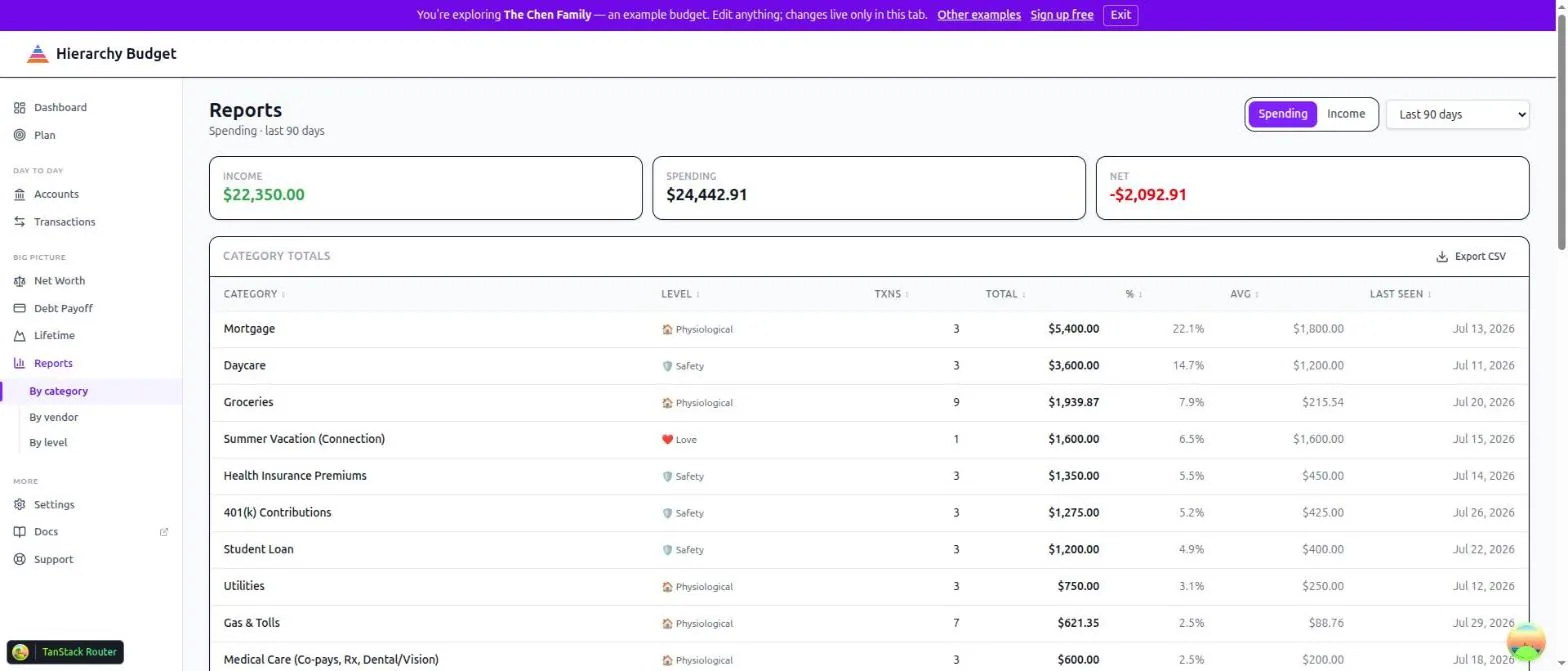
Every category you spent in, ranked. Each row gives the Maslow level, transaction count, total, share of the range, average per transaction, and when you last spent there.
This is the workhorse view. Sort by total to see what dominates, or by count to find the small purchases that add up.
By Vendor
The same, grouped by who you paid. Useful for the question categories can’t answer: how much did this one merchant get from me this year?
If a vendor appears twice under slightly different names, merge them at Settings > Payees.
By Level
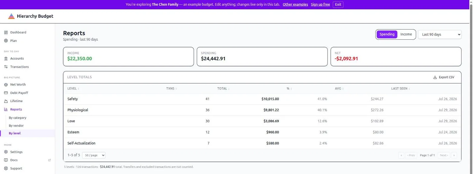
Your five Maslow levels, with the same columns. The shortest report and often the most revealing - it’s the year’s spending reduced to the shape of your needs.
Compare this to your targets in Settings > Allocation. The targets are what you intended. This is what happened.
Exporting
Export CSV on any report downloads exactly what you’re looking at, with the current range and grouping applied. For a full data export instead, see Your Data.
What’s Counted
Categorized transactions in the range, by their category’s Maslow level.
Transfers are excluded. Moving money between your own accounts isn’t spending.
Transactions with no category yet don’t appear under any category - clear the Inbox if your totals look light.
Reading Them Well
Use long ranges. A month is noise. A year is a pattern.
Check “last seen”. A subscription you haven’t consciously used in months still shows up as recent spending.
Look at averages, not just totals. A big total from one purchase means something different than the same total from forty.
Compare By Level to your targets. That gap is the whole point of the app - see the Interpretation Guide for what to make of it.
Related Pages
- Reports - Category, vendor and level totals
- Forecast vs Actual - Spending against the plan
- Interpretation Guide - What the patterns mean
- Your Data - Full exports